KITAB’s data sets are often large and difficult to comprehend. KITAB is, therefore, working to develop and adapt visualisations to help the team and other researchers understand the data. Where relevant we release code and Power BI templates for our visualisations, enabling you to adapt them for your own research, whether or not you are using KITAB’s data.
There is a set of core visualisations that we use routinely in our research and reference in our blog posts and publications. This page explains how those visualisations work and how they should be interpreted. For detailed instructions on how to use the applications, please visit our docs.
Please note: This list of visualisations and applications is being continually updated as we formalise and release our applications. If you are unsure about any of the visualisations used in a publication or a blog post we recommend you return here.
To access and use our applications and visualisations, please visit the applications portal.
The pairwise text reuse visualisation
This application is designed for viewing text reuse between pairs of texts. Image 1 shows a screen grab from the main part of the visualisation.
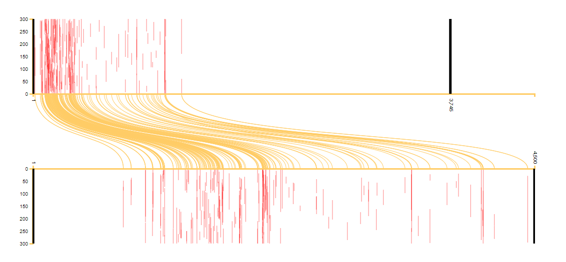
Image 1: A pairwise visualisation comparing Ibn Taghribirdi’s Nujum (on the top) with Ibn al-Athir’s Kamil (on the bottom).
This visualisation layers many types of data. Put simply, it represents each of the two works as a scroll laid on its side, with the top on the left, the bottom on the right and each line containing 300 words (marked on the y-axis). Along the x-axis, each work is divided into milestones (on text reuse and milestones, see our explanation of the passim algorithm). Thus, the top graph in image 1 shows Ibn Taghribirdi’s (d. 1470) Nujum, and 1 represents the first milestone in the book while 3,745 represents the last milestone. The bottom graph in image 1 shows Ibn al-Athir’s (d. 1234) Kamil; 1 is the first milestone in the book and 4,500 is the last.
Text passages that are common to both works are highlighted in red. Each of the red bars in the top and bottom graphs represents a milestone that contains text reuse. The height of the bar is determined by the position and length of the reused text within the milestone. For example, a bar that starts at 50 and ends at 100 on the y axis means that the reuse occurs between word 50 and word 100 of that 300-word milestone and that it the reused passage is, therefore, fifty words long.
The yellow lines link the reused passages in the two works. For example, text found around milestone 700 of Ibn al-Athir’s Kamil (the bottom graph) is reused at milestone 1 of Ibn Taghribirdi’s Nujum. The yellow lines allow us to understand rearrangement of the text. In the case of Image 1, we can see that the text is reused in almost the same order, but in condensed form. As both works are chronicles, this is to be expected.
Had the text been rearranged, more lines would cross over each other. See, for example, Image 2, which compares al-Tabari’s Taʾrikh with Ibn Hanbal’s (d. 855) Musnad. There we can see heavy reuse of the early parts of al-Tabari’s work (the parts that cover the Prophet’s life) by Ibn Hanbal, but because the Musnad is not a chronological account, the text has been rearranged and the lines cross over.
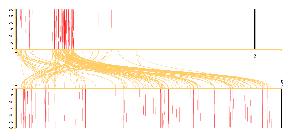
Image 2: A pairwise visualisation comparing al-Tabari’s Taʾrikh (on the top) with Ibn Hanbal’s Musnad (on the bottom).
We often provide screen captures of such visualisations in our publications to illustrate our discussions of book history. They are, however, part of an interactive visualisation. In the interactive visualisation, clicking on a red line that represents a reused passage, or on the yellow line linking two passages, will bring up the text of the alignment in each of the two works and provide the context, allowing you to read and understand the particular reuse instance.
The diff viewer: highlighting differences and similarities
This visualisation compares two pieces of text and highlights either the differences or the similarities between them.
In our interactive text reuse visualizations, we use this tool to display the aligned passages detected by the passim algorithm). It allows us to get a quick visual impression of how closely two reused passages resemble each other, and to read the passages closely.
By default, the diff viewer highlights the differences between both texts.
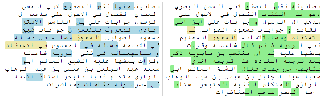
Image 3: Parallel passages in the diff viewer.
In this example,
- text that is common between both fragments is not highlighted;
- text that is only in the left-hand fragment but not in the right-hand fragment is highlighted in blue;
- text that is only in the right-hand fragment but not in the left-hand fragment is highlighted in green;
- and text that is shared between passages but in a different location is highlighted in light orange.
It is also possible to highlight the similarities rather than the differences; in that case, shared text is highlighted in blue and displaced text is highlighted in light orange:
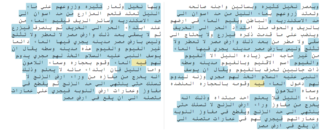
Image 4: The diff viewer highlights the similarities between passages from al-Istakhri’s Masalik and Ibn Hawqal’s Surat al-ard.
The diff viewer has been fully integrated into our interactive visualizations; but it can also be accessed separately here.
Peter wrote a blog with an in-depth description of the diff viewer.
Corpus-wide text reuse visualisation: scatter plot
This visualisation shows the text reuse relations of one text (which we will call the “main text” of this visualisation) with the entire corpus. It is a useful tool to get a visual overview of how embedded a work is in the whole corpus; which other texts in the corpus have most in common with it; which parts of the text are most connected to other texts in the corpus, and which are more singular; and whether there is a chronological dimension to reuse of (part of) the work.
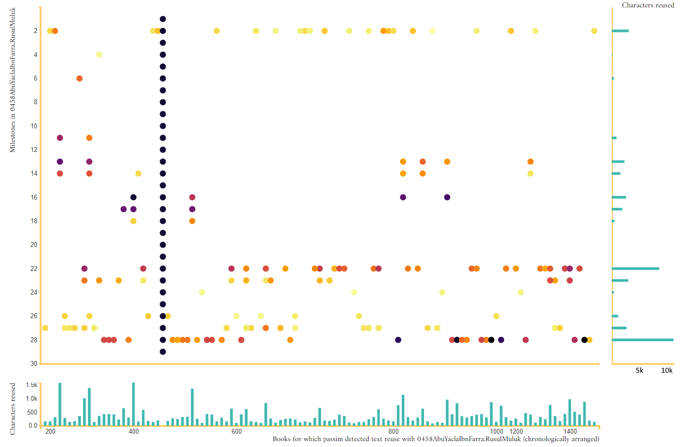
Image 6: A scatter-plot visualization of the Ibn al-Farra’s Rusul al-Muluk.
In the central part of the graph, a scatter plot, the main text is depicted as a series of black dots along the Y axis, one for each milestone (a milestone is our term for a 300-word chunk of the text): the first milestone (the beginning of the book) is at the top of the graph, the last at the bottom.
All other texts in the corpus in which passim), our text reuse detection tool, found shared passages are depicted in chronological order on the X axis: the earlier texts on the left and the later texts on the right. For each milestone in the corpus that has a shared passage with the main text, we put a dot on the location corresponding to the position of this book on the X axis and the position of the milestone in the main text (Y axis). The colour of the dot represents the intensity of the text reuse between the two milestones: the number of characters of the milestone in the main text that are covered by the text reuse alignment with the milestone in the other book.
In the interactive version of this visualisation, when you hover your mouse over a dot in the graph, a popup will show the location of the milestones in both books and the number of characters in the aligned passage in the main book. Clicking on the dot will allow you to view the alignments, highlighting differences between them.
In order to make it easier to see which books have most in common with the main book, a bar plot is provided at the bottom of the scatter plot. Each of the bars represents a single book in the corpus; the length of the bar represents the number of characters in the main book with which passim found alignments in this book.
In the interactive version, hovering over the bar will show the URI of the book and the total number of characters in the main book for which passim detected text reuse with this book. Clicking on a bar will open a new tab in which you can view a detailed visualization of the text reuse between this book and the main book.
To make it easier to estimate which parts of the main book are more (or less) intensively connected to other books in the corpus than others, a second bar plot is provided to the right of the scatter plot. In this bar plot, each bar represents a single milestone in the main book; the length of the bar represents the sum of the number of characters in this milestone in alignments with all other books in the corpus.
In the interactive version, hovering over a bar shows you the exact position of the milestone in the main book and the sum of the number of characters in all alignments involving this milestone across the corpus.
More explanations of our core visualisations coming soon …
Return here to see explanations of our new applications, including
- the corpus statistics application
- the corpus text reuse statistics application
- the book DNA explorer.